Man of letters: on a mission to protect the art of hand-set typography
We may live in a digital age but font of all wisdom Theo Hersey’s first love is analogue typography
Thursday, 2nd April — By Lloyd Bickham

Theo Hersey [Pete Woodhead]
THE words you are reading have been on a remarkable journey.
For the paper, they’ve been edited, laid out, sent digitally to a printing plant, lasered onto a thin metal sheet, treated with a chemistry of oil and water (ensuring that only the right areas “catch” the ink), wrapped around a cylinder, spun so that ink is offset to a rubber roll before finally being transferred to great lengths of moving paper.
It’s dizzying to imagine – and all a little modern for Theo Hersey.
Theo’s on a mission to protect the art of hand-set typography, which he sees as “the perfect antidote to the fast, screen-centric age we’re all living in”. And among the young, 240-strong audience here to learn about his craft, there’s a feeling he might be on to something.
Part of the Southbank Centre’s free “Creative Encounters” evenings, Theo tells the history of print-making, from Gutenberg to the closure of type foundries in 1984. Foundries produced typefaces for publications, which could be chosen from what he describes as an “Argos catalogue for fonts”.
These catalogues boasted an eclectic, artistic selection of type, playing with texture and colour overlay in processes Theo still practices today. His workshop in Walworth houses some of the final type created by large-scale foundries, making up a physical letterpress collection that dates from 1880.
“My mum had a type case, a divided wooden box for letters, in our bathroom when I was growing up, filled with trinkets,” says Theo. “And then, when I was at the London College of Communication studying graphic design, I went on a tour of their printing press. It all just clicked – I thought, ‘that’s a bit of me’.”
He began printing in his second year, and fell in love.
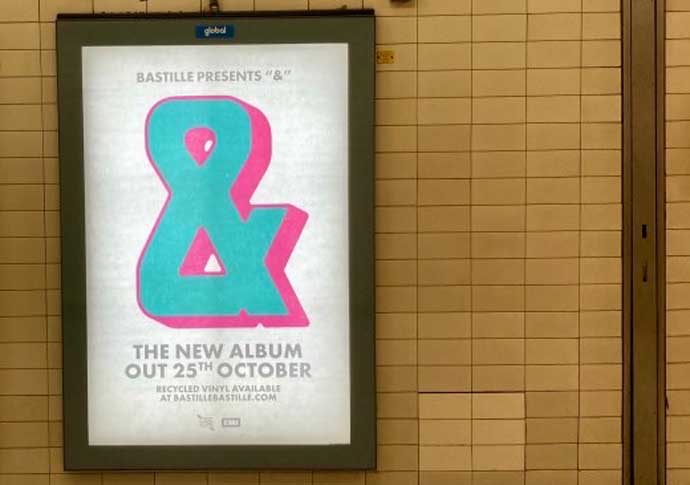
Poster for Bastille’s ‘&’ album [Theo Hersey]
He would end up buying his mentor’s historic workshop in 2023, funded through “a big Kickstarter campaign; we raised £18,000. It was amazing”.
Theo met Brit Award-winning band Bastille at a Kickstarter open day. “I hadn’t yet established the workshop as a business, so it was an amazing stroke of luck and experience,” he said. “Bastille wanted a custom wooden type for the album cover, something only two men in the country still produce.”
Innovative prints have earned him further commissions in the form of promotional material for film streamer Mubi, alongside collaborations with London-based graffiti artist 10Foot.
Back to our Southbank workshop, and we’re each producing individual letters (sort) to form a collective alphabet (font).
“You have to cut out the negative space,” Theo explains, stressing that we must remember to flip our letter designs before cutting away at the lino blocks provided – otherwise they’ll print back-to-front. There’s something mesmeric about this slow, artistic process which yields just one component of a word.
“You can play with this negative space in your design, using it as extra texture for your sort,” we’re encouraged. Imperfections, known as “scumming”, were once considered “bad printing”, but are sought after by clients, drawn to the alchemy of Theo’s arcane expertise.
At the end of the evening, we’re invited to hand press a print using the array of our workshop’s lino creations.
“There’s a real yearning for analogue processes, which are having a renaissance,” beams Theo. As we leave with our custom prints, it’s difficult to resist the infectious pull of his mission to preserve this very special process.
While the industrial printing presses that churn out these very words whir on, Theo is preparing for another week at his workshop. He’s producing a print of the letter “Y”, which, with an experimental layering of inks, will take him seven days to complete.
• Creative Encounters are free events running fortnightly at the Southbank. See details of upcoming sessions at www.southbankcentre.co.uk/events/creative-encounters/
